We design mobile apps that feel good in one hand and a bad mood.


.webp)
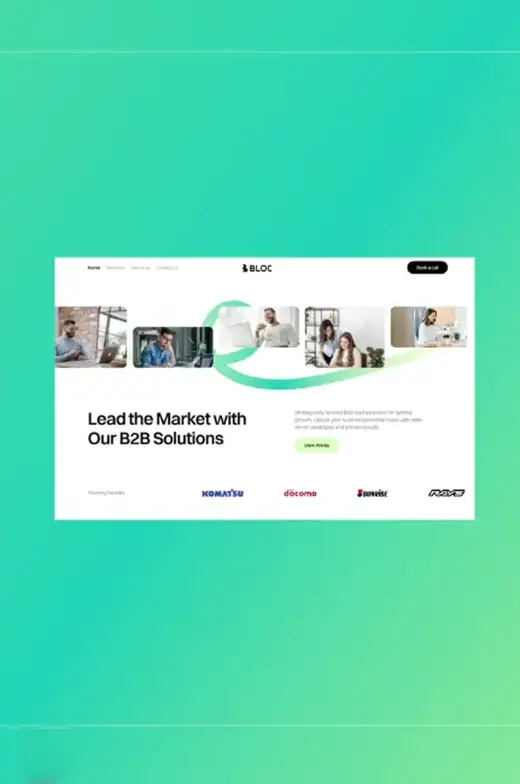

Transforming ambitious ideas into spectacular websites,
Every tap has a job. We make sure yours feels right.
.png)
Thumb-First Design
People use their phones one-handed. We design tap zones, navigation, and core actions around where the thumb actually reaches; not where the screen looks balanced in a mockup.
.png)
Built for the Real First 30 Seconds
Most apps lose users before they ever see feature #2. We obsess over onboarding, first-value, and empty states; the stuff that decides whether someone stays.
.png)
Native Where It Matters
We follow iOS HIG and Android Material where it helps; and break from them where it helps more. Not every app should look like Apple's sample code.
.png)
Dev-Ready Handoff
Clean Figma libraries, platform-aware components, gesture specs, animation specs. So your devs (yours or ours) can ship without guessing.
Small team, sharp mobile, no fluff.
Mobile design rewards simplicity and punishes everything else. A cluttered screen on desktop is annoying. On mobile, it's enough to close the app. Forever.
We've designed mobile apps for fintech, health, productivity, and consumer. The same lesson keeps showing up; users give you about 30 seconds to prove you're worth keeping. Every flow, every screen, every tap has to earn that 30 seconds.
So we design like that. We cut before we add. We test with thumbs. We design for bad internet, low battery, one-handed Tuesday-afternoon-on-the-bus reality.
.svg)
We are a small team of creatives with service oriented mentality

.svg)
.svg)
.svg)
.svg)
.png.svg)
.svg)
Did a lot, published few, wrote even less.
.png)
.png)
Giving you the benefits of your doubt.

Designed for Real Hands
We design for the actual thumb, not the hypothetical perfect user. Reachability, tap target size, gesture
logic; all tuned for how people really hold their phones.
.svg)
First 30 Seconds Obsessed
Most users churn before they see your best feature. We focus on the onboarding and first-value moments that's where retention is won.
.svg)
Platform-Aware, Not Platform-Slave
We respect iOS and Android conventions where they help users; and ignore them where they hurt. Your app should feel native and unique.
We're not for everyone, and that's the point.

Most mobile app designs are just desktop apps squeezed into a phone frame. Tiny type. Un-tappable buttons. Ignored platform conventions. "It works on mobile" is not the same as "it's designed for mobile."
So we built Squidx differently.
We're a small team of designers who've designed, used, and shipped mobile apps on both platforms for years. We care about thumbs, attention spans, bad signal, and the reality of how people actually hold their phones. We design for that; not for the perfect demo.
Yours questions answerd.

At Squidx, the process is easy and collaborative. It starts with a kickoff call to understand your goals and ideas. You give feedback, and we handle the details from there.
Every two days, you get updates through written messages or Loom videos, depending on what’s needed, and we’re always available for a quick chat or call.
Your satisfaction is our priority, and we’re committed to getting it just right. If you’re not satisfied, we’ll make revisions until it feels right. This dedication to client happiness is why we currently maintain a high $74% retention rate.
Hiring a full-time designer can be tough to manage and costs around $50-100k per year.
With us, you get top-notch design support without the overhead and hassle.
We like to work fast. That said, the speed and the amount of work we can do for you depends on the scope of work and your priorities. On average, you can generally expect a simple website or a brand identity done in 2-5 weeks or even faster.
We like to work fast. That said, the speed and the amount of work we can do for you depends on the scope of work and your priorities. On average, you can generally expect a simple website or a brand identity done in 2-5 weeks or even faster.
We love customer feedback! There are 3 main ways you can share your feedback - a Loom video, Figma comments, or a message. Our preference is a Loom video or Figma comments. But any combination of these 3 will do the trick! If not, a simple call will do the job.
If you’re not satisfied with the work, we’ll refund half of the upfront payment. While this is rare, as design can be subjective, we want you to feel confident in our work.
Ready to discuss your project with us?

Based on 25+ reviews


.svg)
.svg)